Understanding dvh: The CSS Dynamic Viewport Height

The evolution of CSS has consistently aimed to improve the developer experience and provide greater control over styling. One of the newer additions to the CSS ecosystem is the dvh unit, which addresses a long-standing issue related to viewport height calculations, especially on mobile devices.
In this blog post, we’ll dive deep into what dvh is, why it was introduced, and how to use it effectively in your projects.
What is dvh?
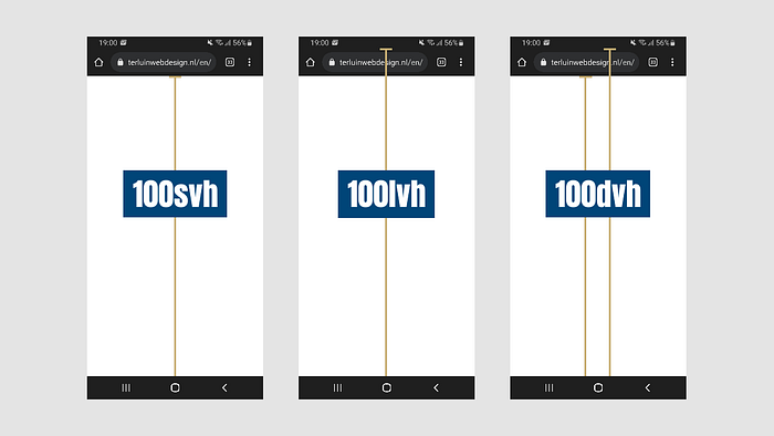
The dvh unit stands for Dynamic Viewport Height. It represents 1% of the viewport height, similar to the existing vh unit. However, the key difference lies in how the viewport height is calculated:
vh: Represents 1% of the initial viewport height.dvh: Represents 1% of the dynamic viewport height, which updates to reflect real-time changes in the browser's viewport size.
This distinction is crucial for addressing issues where the viewport height changes dynamically due to browser UI changes, such as the appearance or disappearance of the address bar or other on-screen elements.
The Problem with vh
On mobile devices, the traditional vh unit can create inconsistencies in layouts because it calculates the height based on the browser's viewport at the time the page is loaded. This doesn’t account for changes that occur when the user scrolls or interacts with the page, causing the browser UI to adjust.
For example:
- The browser’s address bar might shrink or disappear when the user scrolls down, but
vhwill still use the original height, leaving unexpected gaps or cut-offs in the layout.
Developers often had to rely on complex JavaScript workarounds to recalculate and update the layout dynamically, which added to the development overhead.
How dvh Solves the Problem
The dvh unit dynamically updates as the viewport size changes. This means that even if the browser's UI (like the address bar) appears or disappears, elements styled using dvh will adapt to the new dimensions.
For instance:
.fullscreen-section {
  height: 100dvh;
}
In the above example, the fullscreen-section will always occupy the full dynamic height of the viewport, regardless of any browser UI adjustments.
Practical Usage
Example 1: Fullscreen Sections
Using dvh ensures that fullscreen sections behave as expected on all devices:
.fullscreen {
  height: 100dvh;
  background: linear-gradient(to bottom, #4facfe, #00f2fe);
}
Example 2: Popup Modals
When designing popup modals or overlays, dvh ensures they remain properly positioned and sized:
.modal {
  height: 90dvh;
  width: 80%;
  margin: 5dvh auto;
  background: white;
  border-radius: 10px;
  box-shadow: 0 4px 6px rgba(0, 0, 0, 0.1);
}
Example 3: Hero Sections
Hero sections on landing pages can now reliably occupy the intended space without unexpected gaps:
.hero {
  min-height: 100dvh;
  display: flex;
  justify-content: center;
  align-items: center;
  background-image: url('hero-background.jpg');
  background-size: cover;
}
Browser Support
As of late 2024, dvh has widespread support in modern browsers, but you should still check compatibility if you're targeting older versions or specific platforms. A fallback to vh can be implemented for unsupported browsers:
.element {
  height: 100vh; /* Fallback */
  height: 100dvh; /* Modern browsers */
}
Understanding lvh and svh
Alongside dvh, two additional viewport height units—lvh and svh—have been introduced to provide developers with even finer control over layouts. Here’s what they mean and how they differ:
What are lvh and svh?
lvh (Large Viewport Height):
Represents 1% of the largest possible viewport height, typically the height when all browser UI elements (such as the address bar) are hidden. This is useful for ensuring consistent layouts when you want to account for the maximum available screen space.
svh (Small Viewport Height):
Represents 1% of the smallest possible viewport height, which is usually when the browser UI is fully visible. This unit is ideal for scenarios where you want to ensure that elements fit within the visible space without being obstructed by UI elements.

Practical Usage
Example 1: Persistent Layouts
To create a layout that doesn’t adjust with dynamic UI changes, lvh ensures the design utilizes the maximum available height:
.fullscreen {
  height: 100lvh;
}
Example 2: UI Safe Zones
If you need to guarantee that elements are fully visible within the smallest viewport, svh ensures compatibility:
.header {
  height: 10svh;
  background: #333;
  color: white;
}
Example 3: Combining Units for Flexibility
You can combine these units with dvh for responsive designs that adapt to various viewport states:
.section {
  min-height: 100svh; /* Ensures visibility */
  max-height: 100lvh; /* Uses maximum space when available */
}
Why Use lvh and svh?
These units provide a way to tailor designs based on specific viewport constraints:
lvhis perfect for immersive experiences like fullscreen apps or games.svhensures safety for content visibility on mobile devices where UI elements might obscure parts of the layout.
Together with dvh, these units empower developers to create robust, adaptive, and consistent layouts across devices and scenarios.
Key Takeaways
dvhadapts to real-time changes in the viewport height, solving layout inconsistencies caused by browser UI adjustments.- It eliminates the need for JavaScript workarounds for dynamic height adjustments.
dvhis especially useful for mobile-first designs, fullscreen layouts, and responsive web applications.
By incorporating dvh into your CSS toolkit, you can create layouts that are more reliable, visually consistent, and user-friendly across devices.
Conclusion
The dvh unit is a welcome addition to CSS, reflecting the continuous evolution of web standards to meet real-world needs. If you've ever struggled with viewport height inconsistencies, now is the time to embrace dvh and simplify your styling workflows.
Ready to try it out? Update your projects and experience the difference! 🚀
What are your thoughts on dvh? Share your experiences in the comments below!


